Project Details
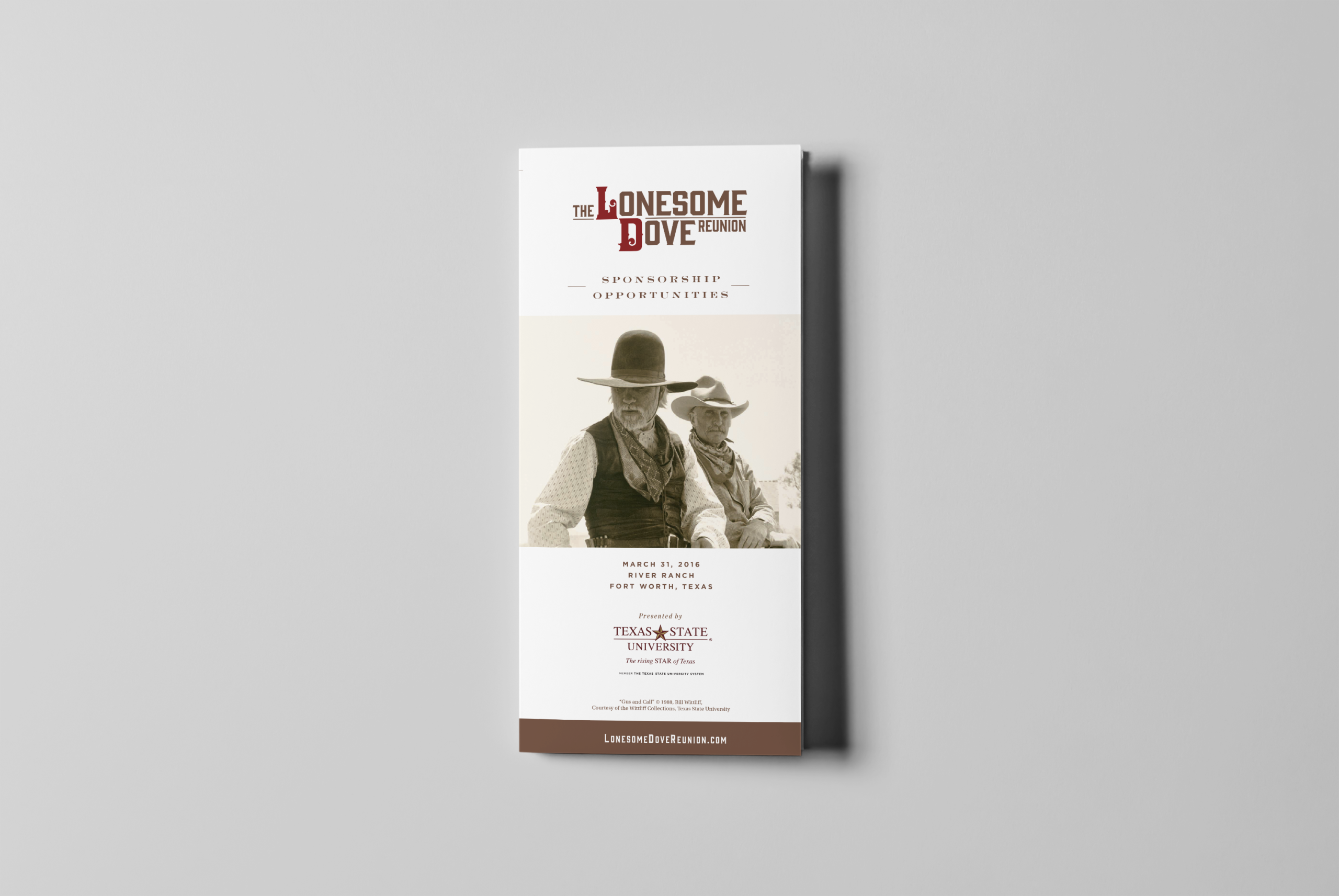
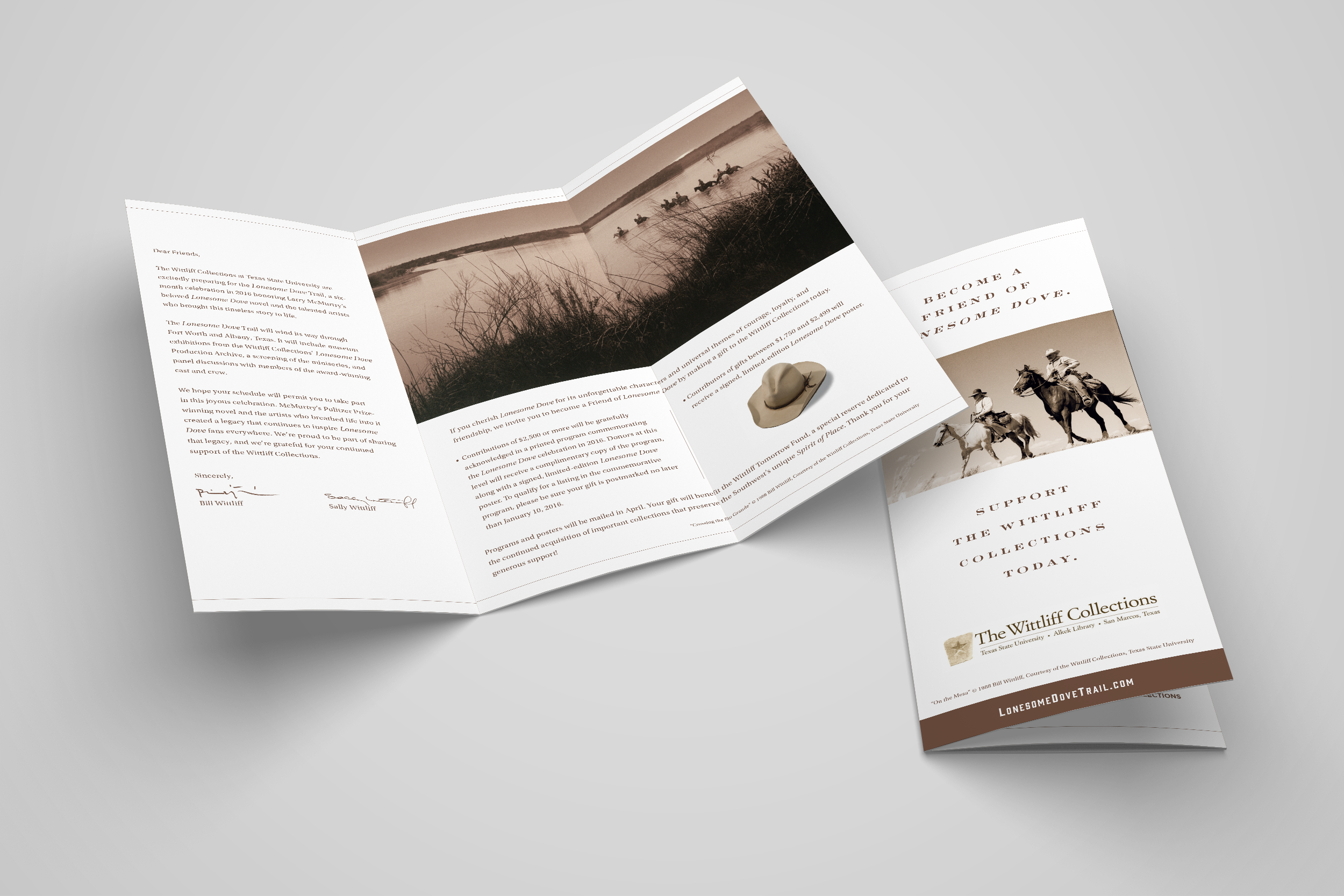
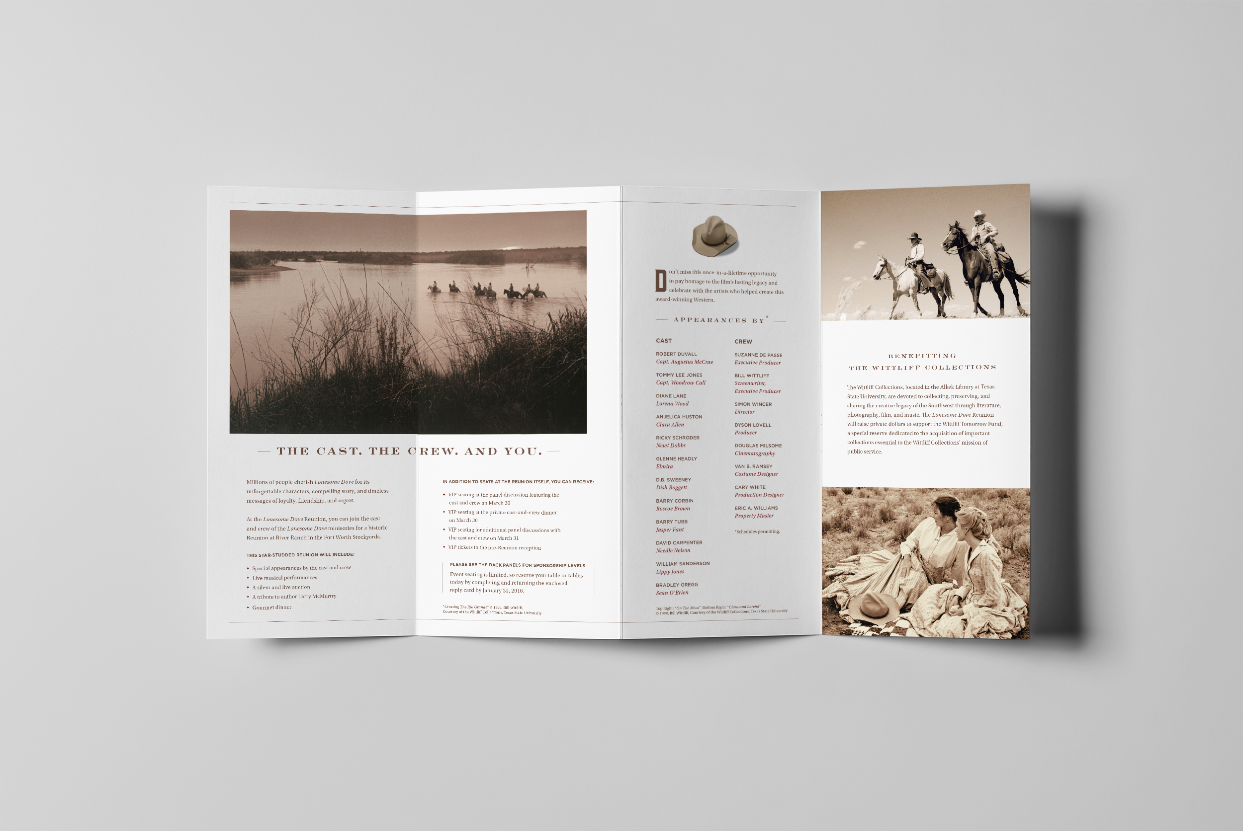
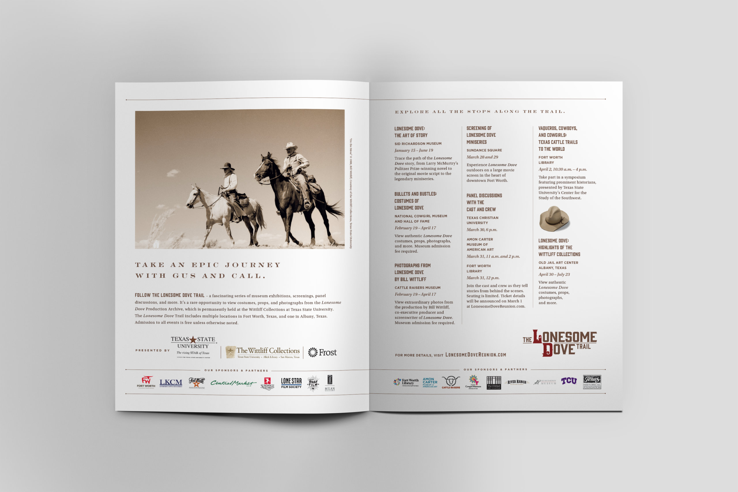
The Lonesome Dove Reunion brought together a story I had admired for years with the kind of project I wanted to be part of, working with Brian Pierce Marketing, Texas State University and The Wittliff Collections to develop the identity for a months-long celebration of Larry McMurtry’s novel and Bill Wittliff’s television adaptation. The reunion in the Fort Worth Stockyards served as the centerpiece of the campaign.
Before I began designing, I drove to Archer City, where McMurtry wrote Lonesome Dove. I wanted to spend some time in the place behind the story and better understand the landscape and character that shaped it, rather than approach the project by simply borrowing from familiar Western imagery.
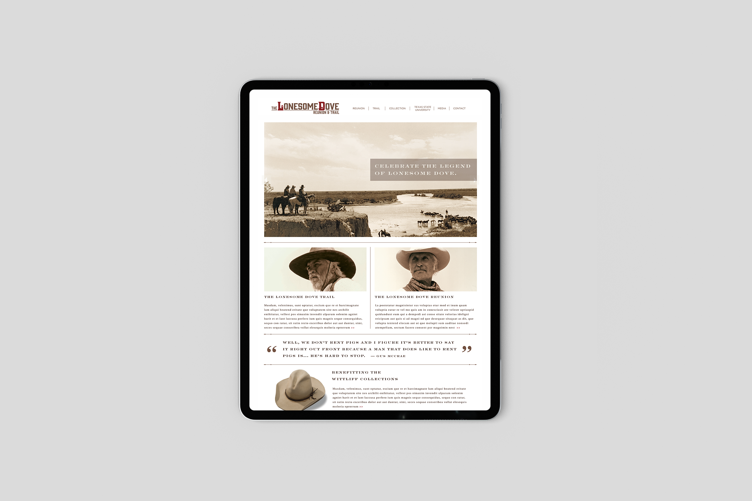
Lonesome Dove already had a visual history that people knew and loved, so there was no reason to reinvent it. I wanted to build on what was already familiar and create something specifically for the reunion that felt connected to the book and miniseries while still having a character of its own.
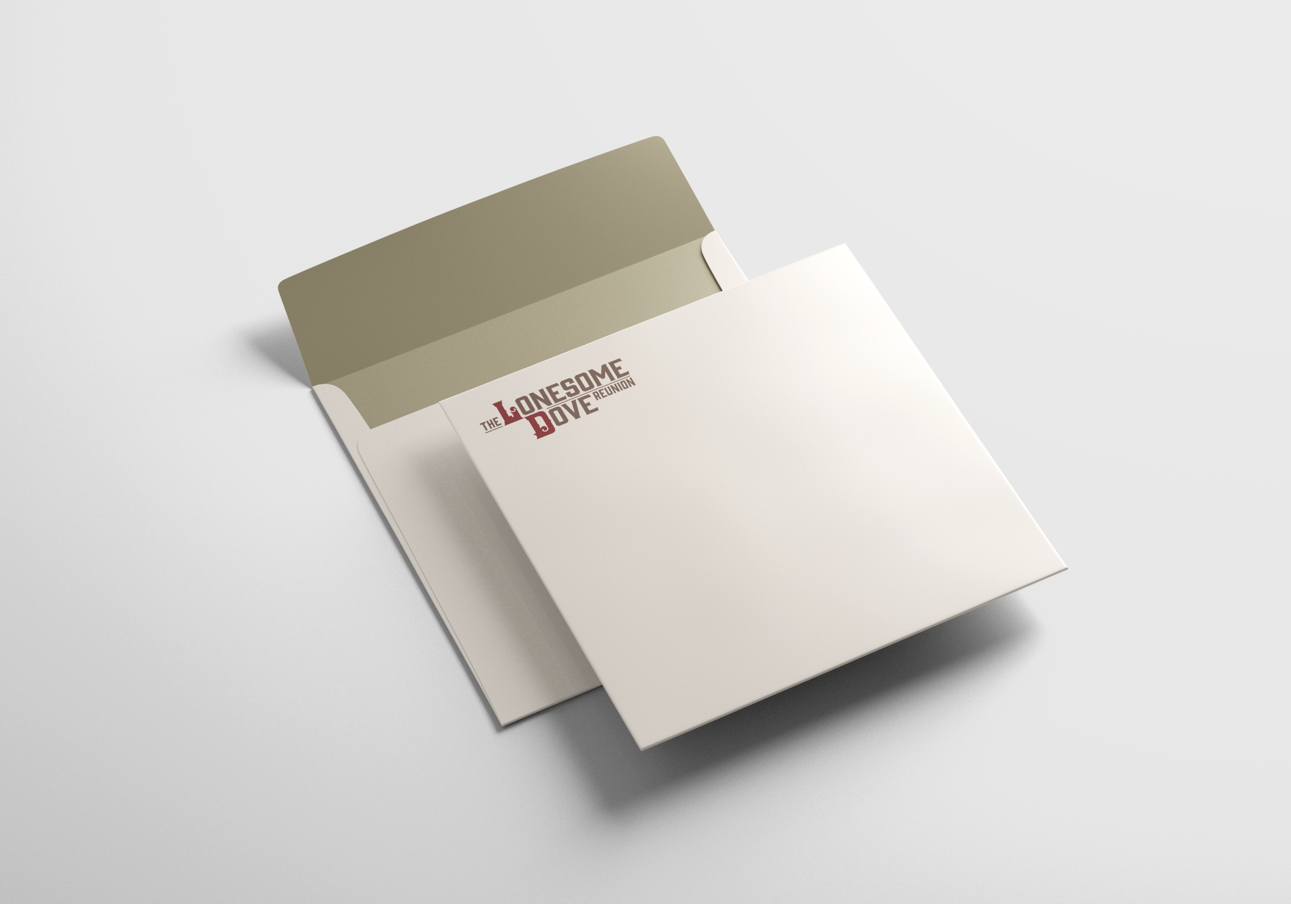
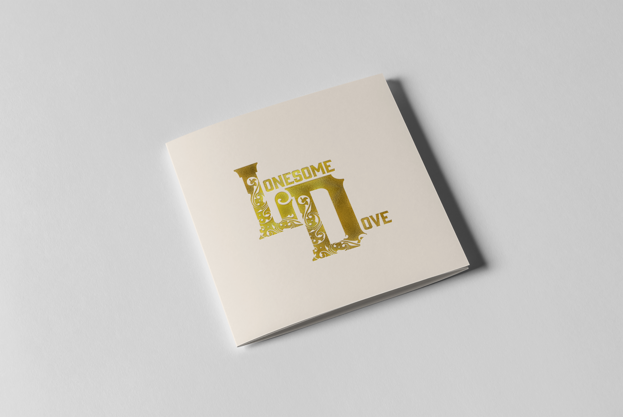
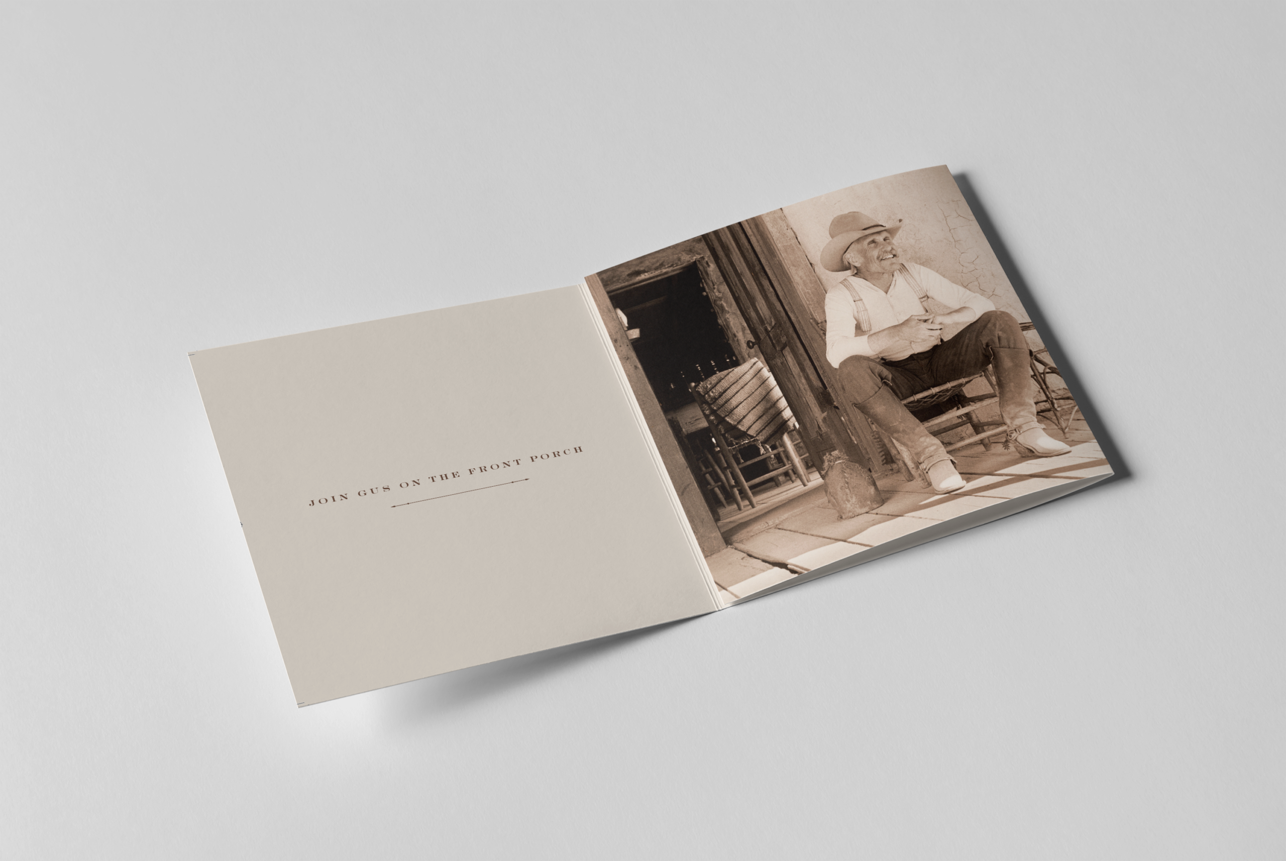
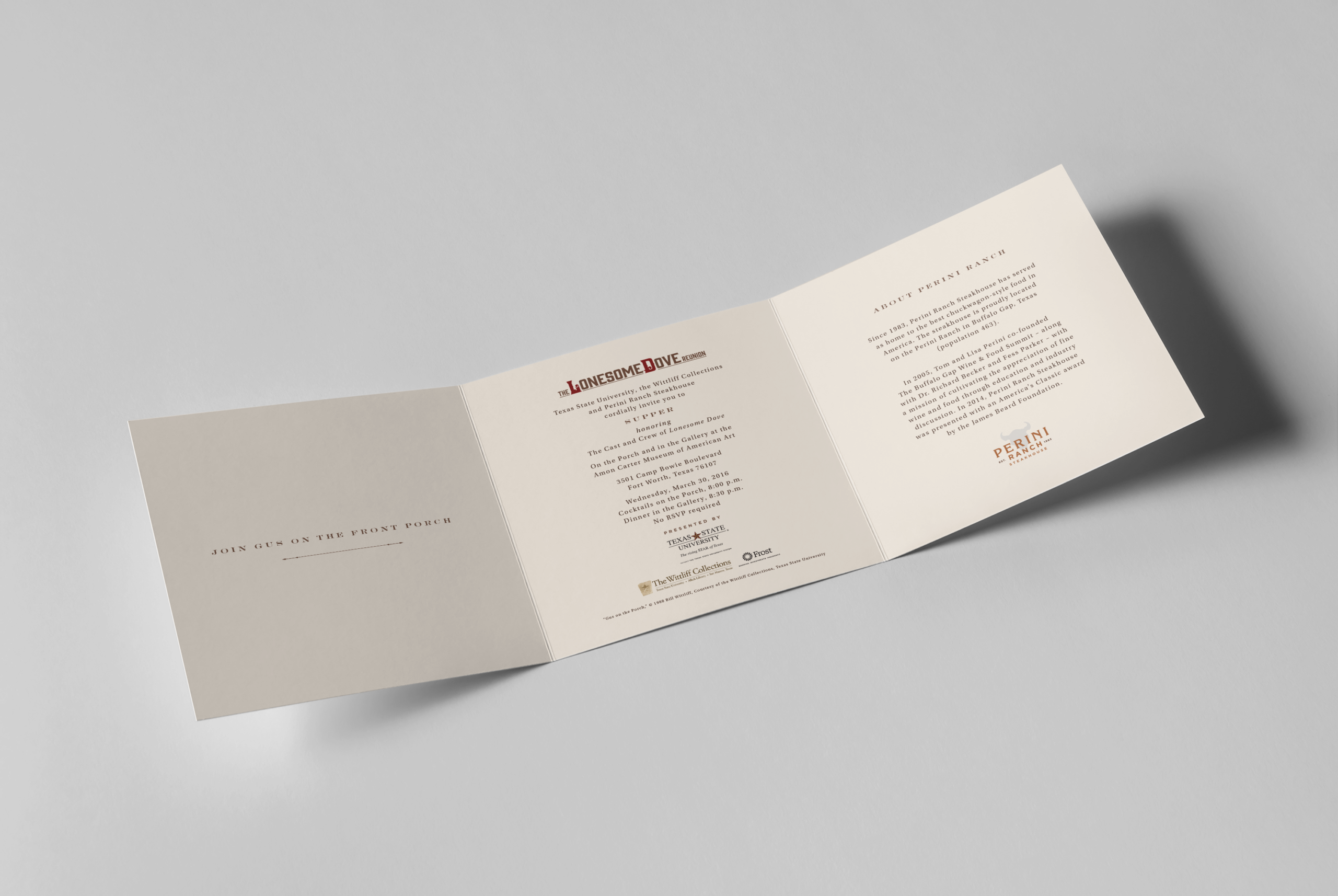
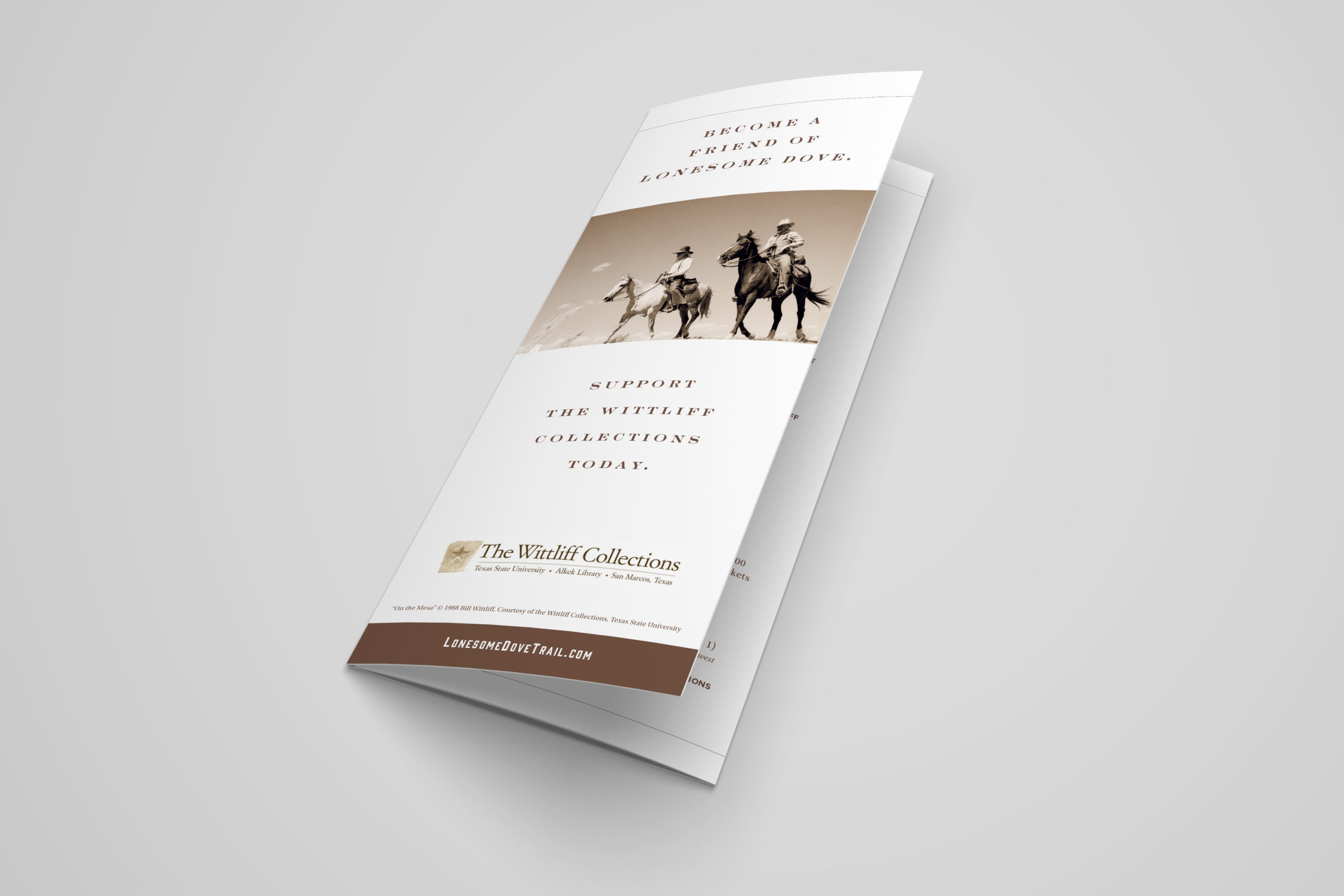
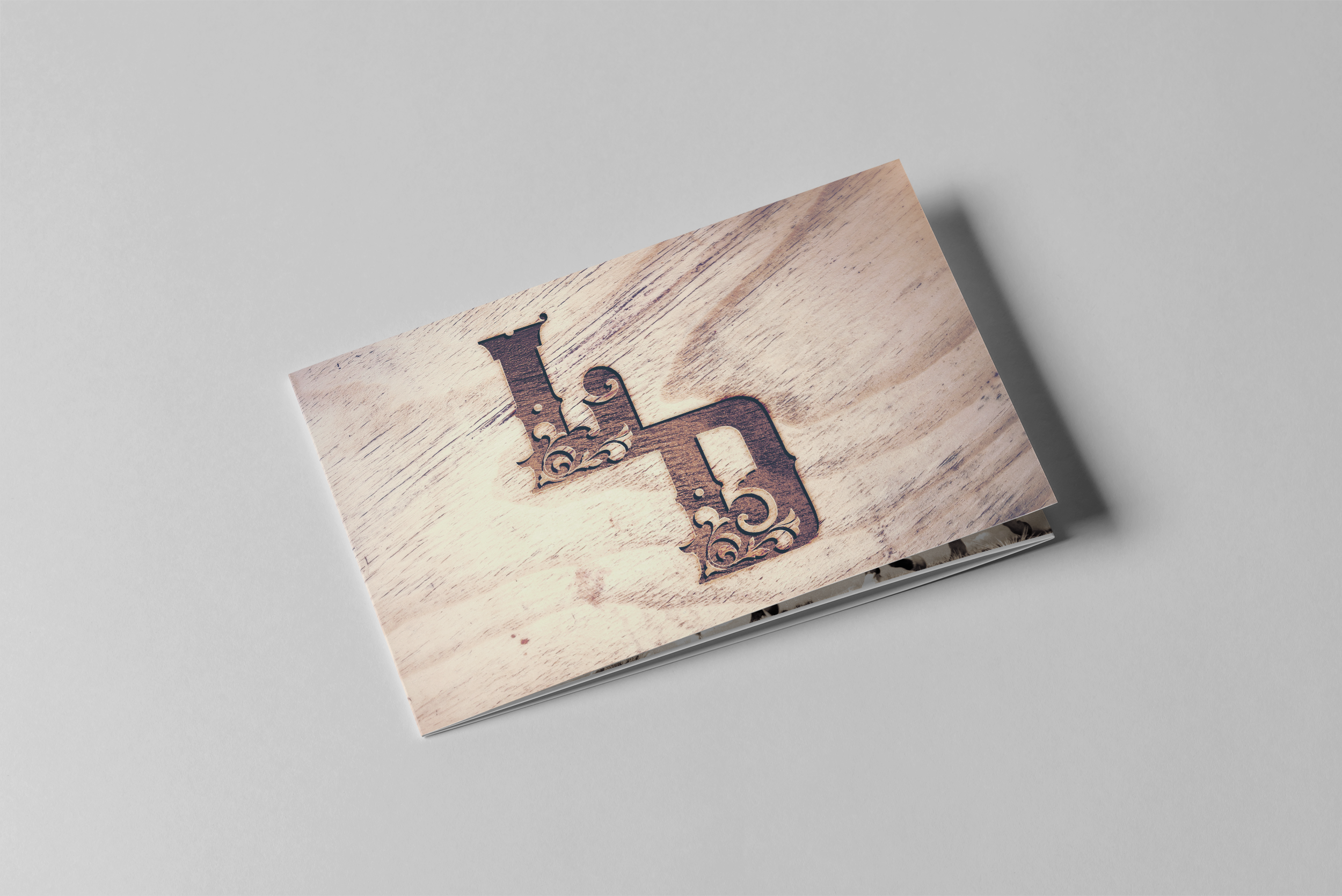
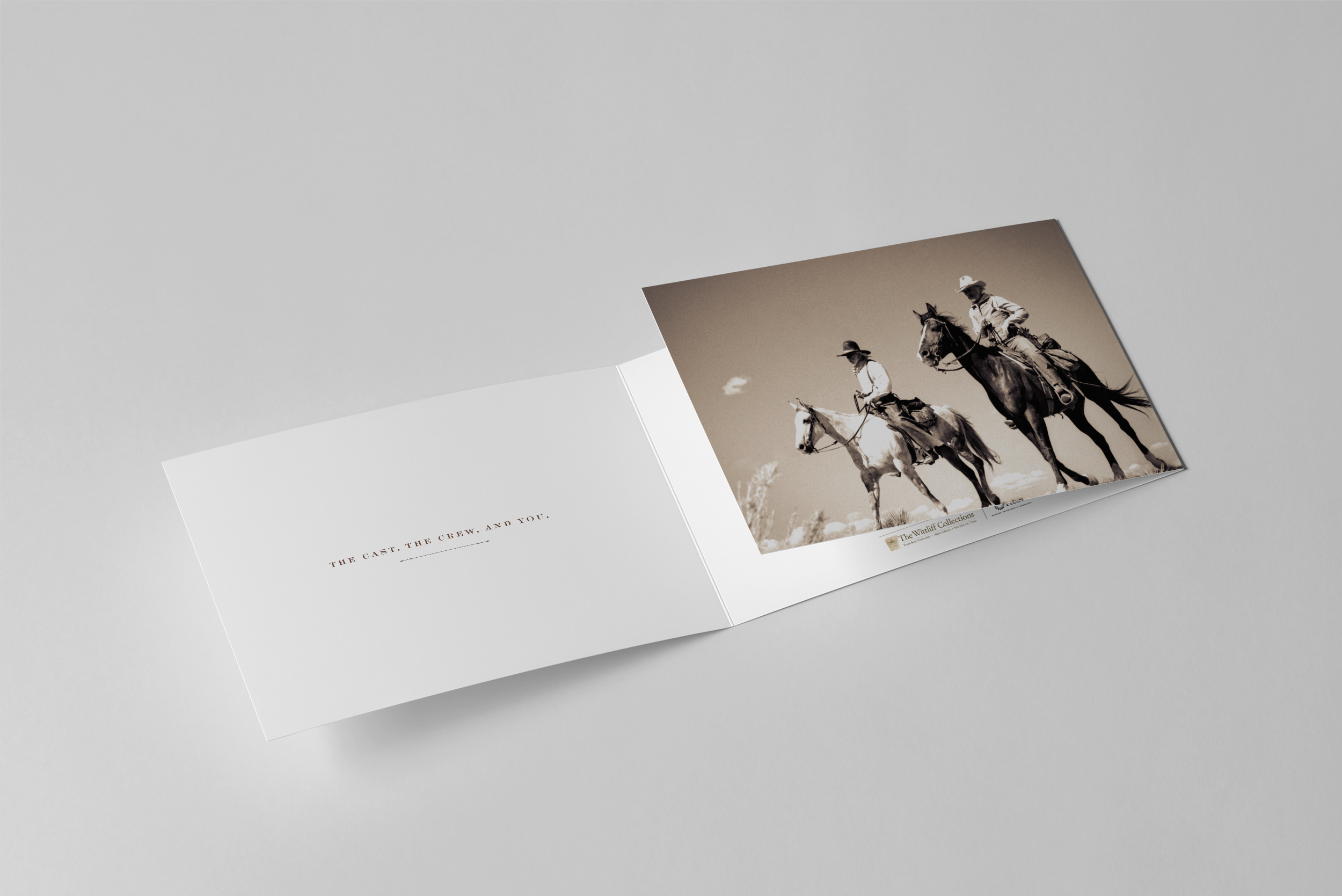
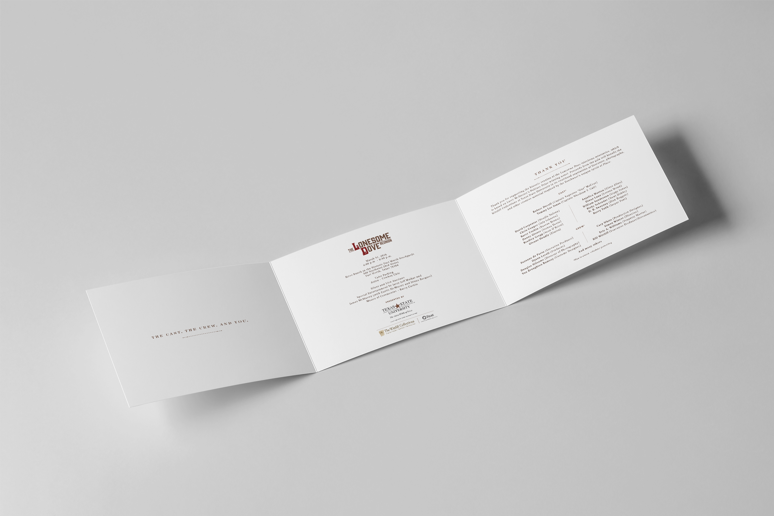
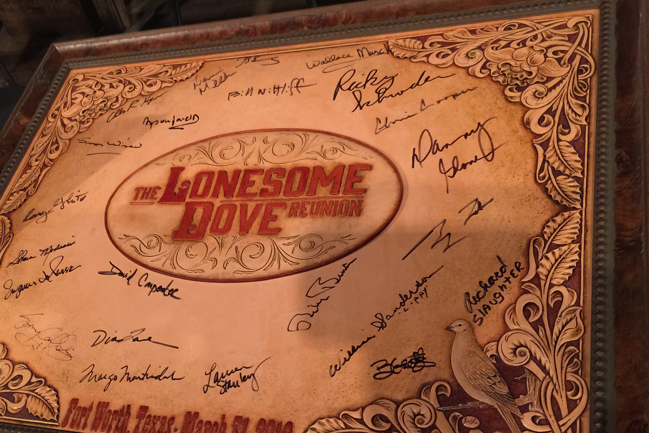
The mark grew from typography associated with Lonesome Dove, with custom tooling added to the “L” and “D” for special applications such as the foil-stamped VIP invitation. For the primary identity, I simplified the system and used gunmetal brown with burgundy, giving it enough flexibility to work across invitations, advertising, rack cards and the broader campaign.
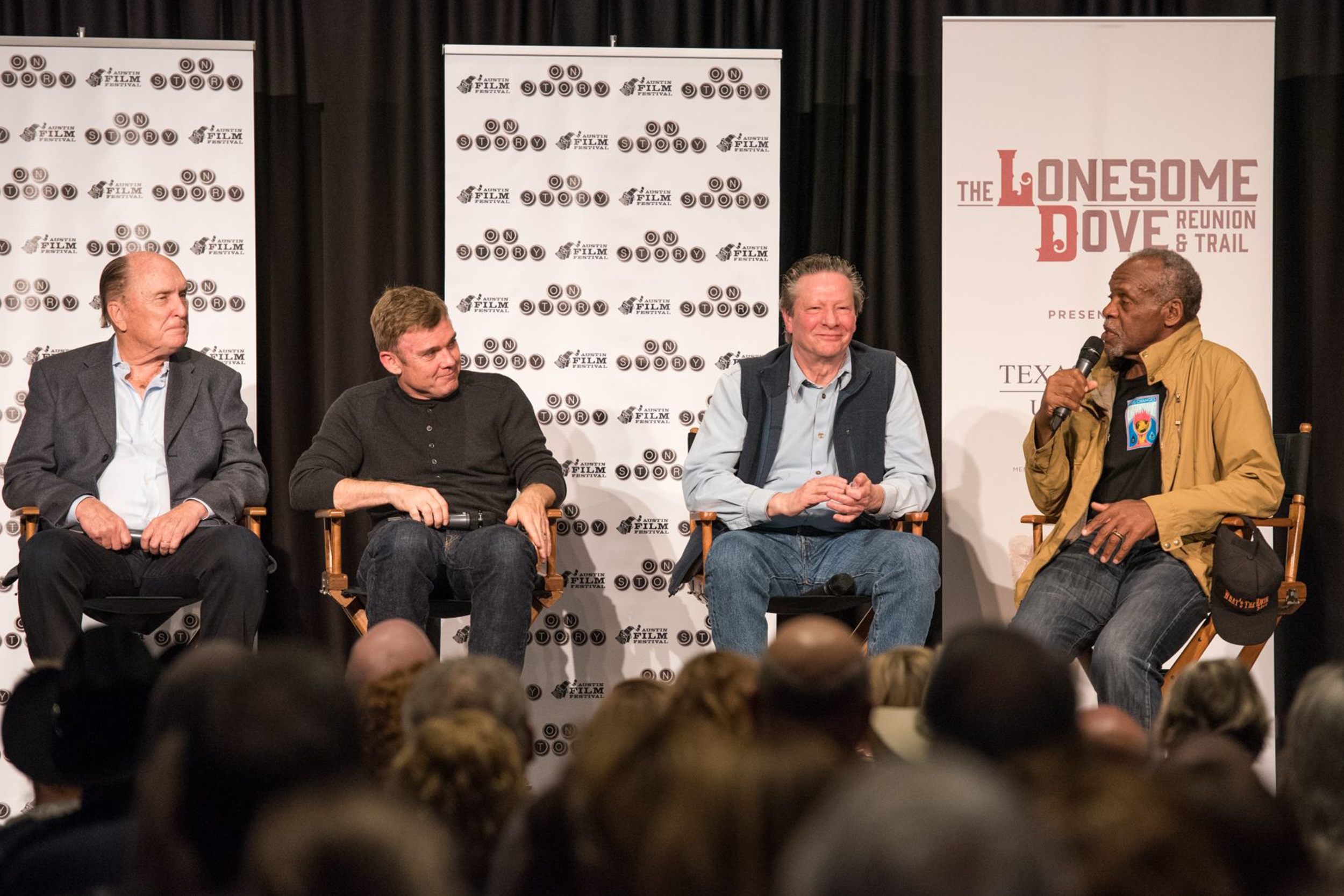
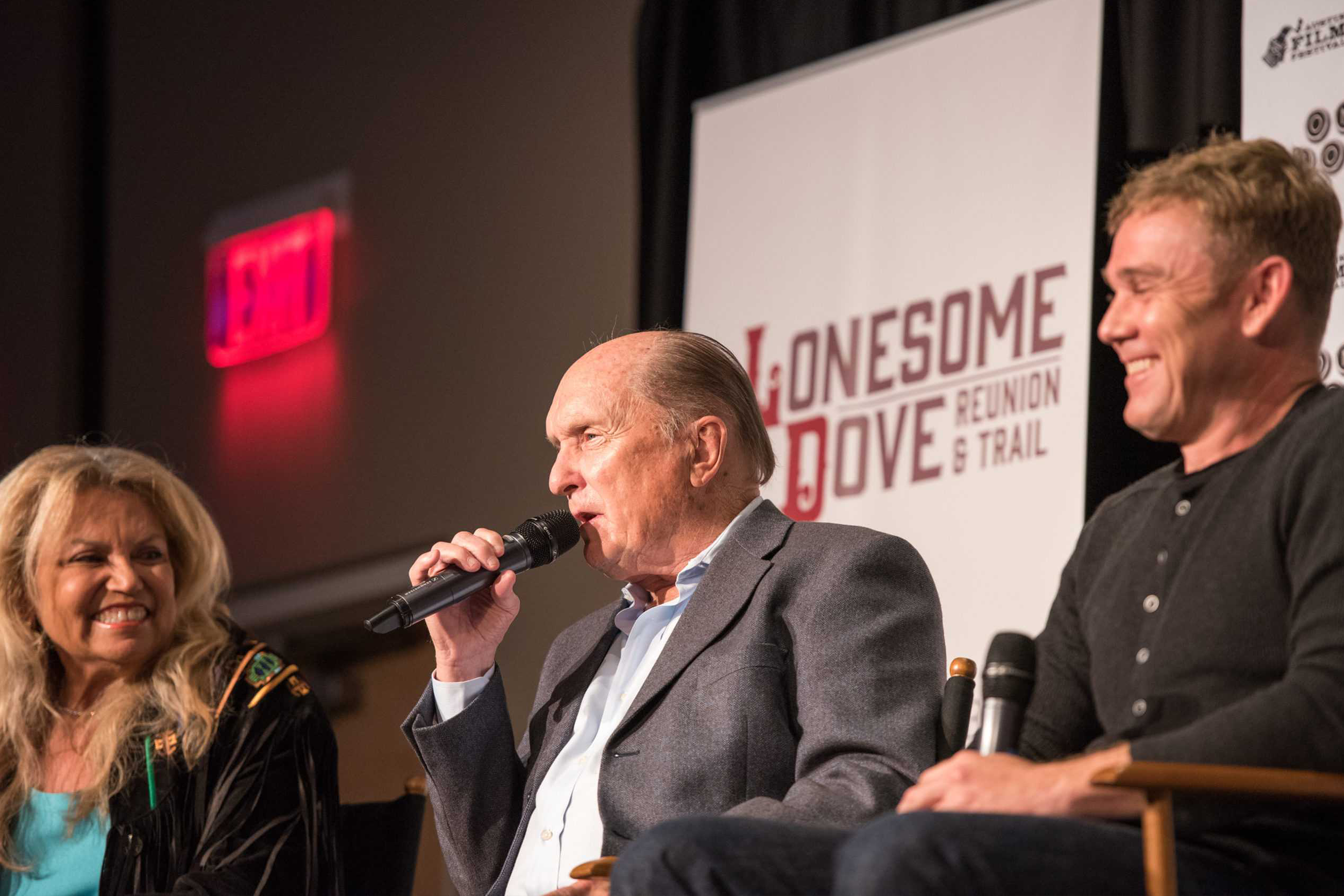
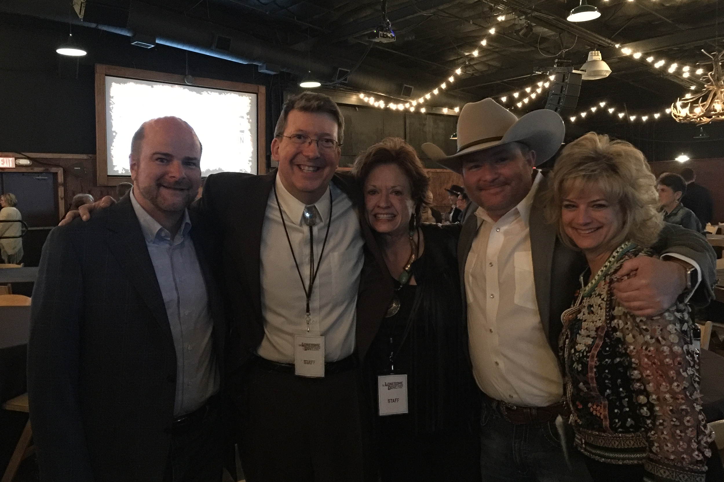
The reunion became part of a much larger Fort Worth celebration that included exhibitions, screenings, discussions and appearances by members of the original cast and crew. The event sold out shortly after it was announced, drew national media attention and ultimately helped raise more than $1 million for The Wittliff Collections.
It remains one of the most important projects of my career because it brought together design, Texas history and a story I already had a great deal of respect for, while giving me the responsibility of creating work for Bill and Sally Wittliff and a project that meant so much to everyone involved.